Kofi
Estimated reading time: 5 minutes

Kofi is well... Coffee!
A can design blending playfulness
and minimalism.
This project explores how illustration, colour, and typography can create a distinctive shelf presence.
I handled the full design process, from concept and visual design to layout, typography, and preparing print-ready files.
Concept
I wanted to create something that feels cool yet inviting. Since coffee is the start to many people's days, I felt the design should evoke positive feelings.
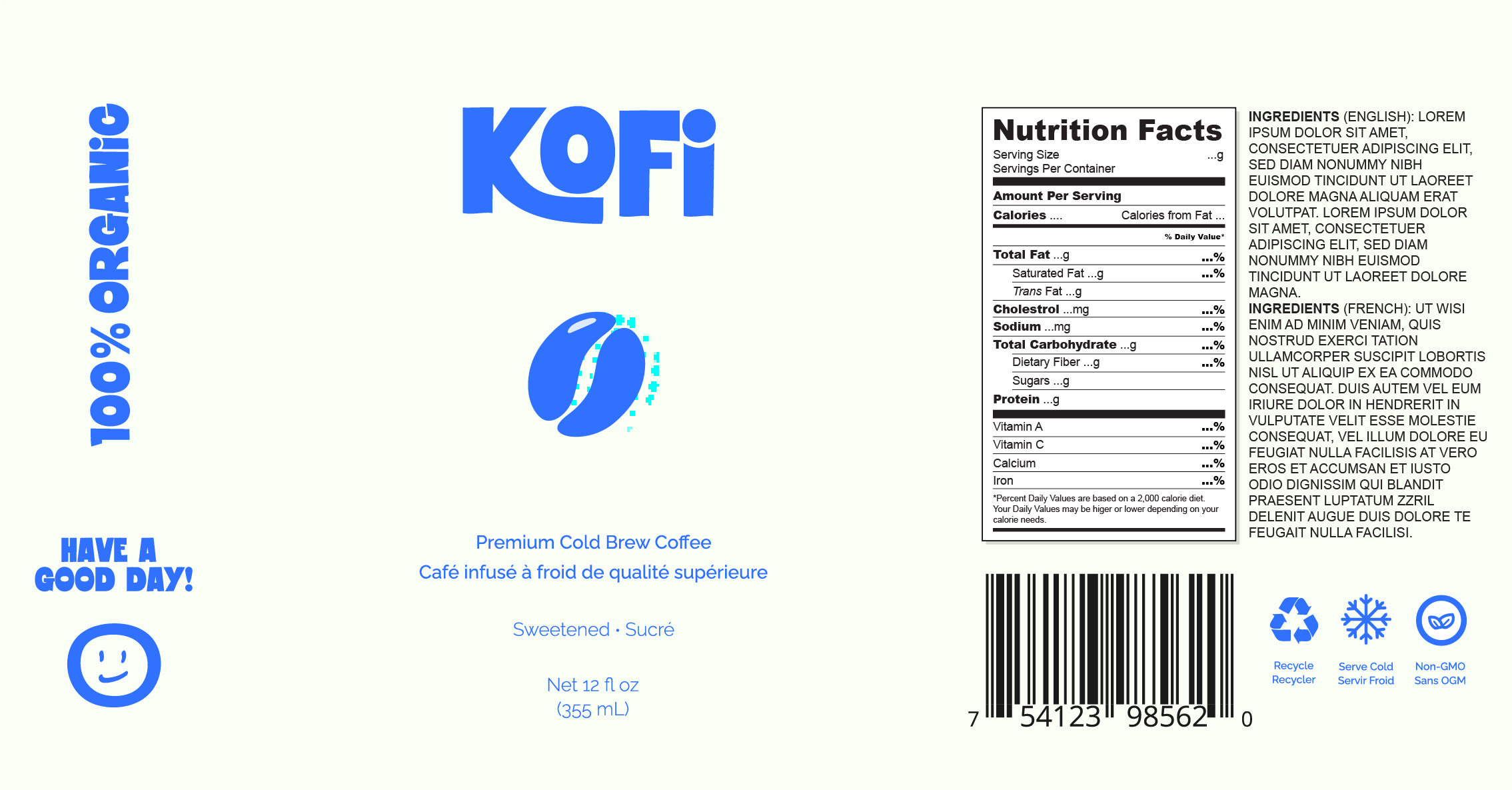
Initial Design
In the beginning, I started designing on a short can right away without giving it a second thought.
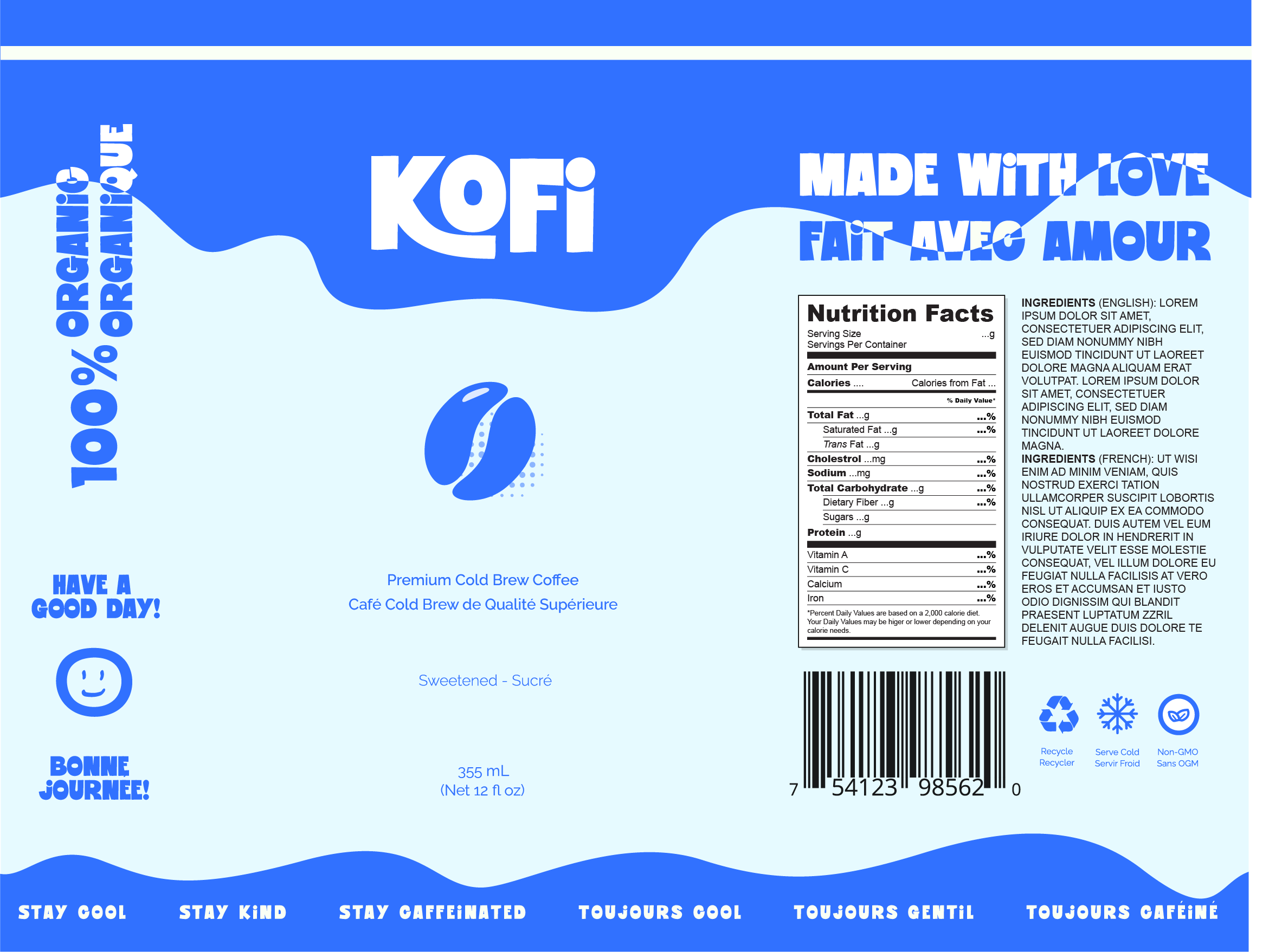
Considerations
After looking at mockups and real products, the short can felt stubby and unappealing, so I switched the design to be on a tall can.
Tall cans generally feel more premium, elegant, and are easier to hold.
Not to mention, there is more room to work with. I also needed space for both English and French for people across Canada so it worked out perfectly.
Redesign
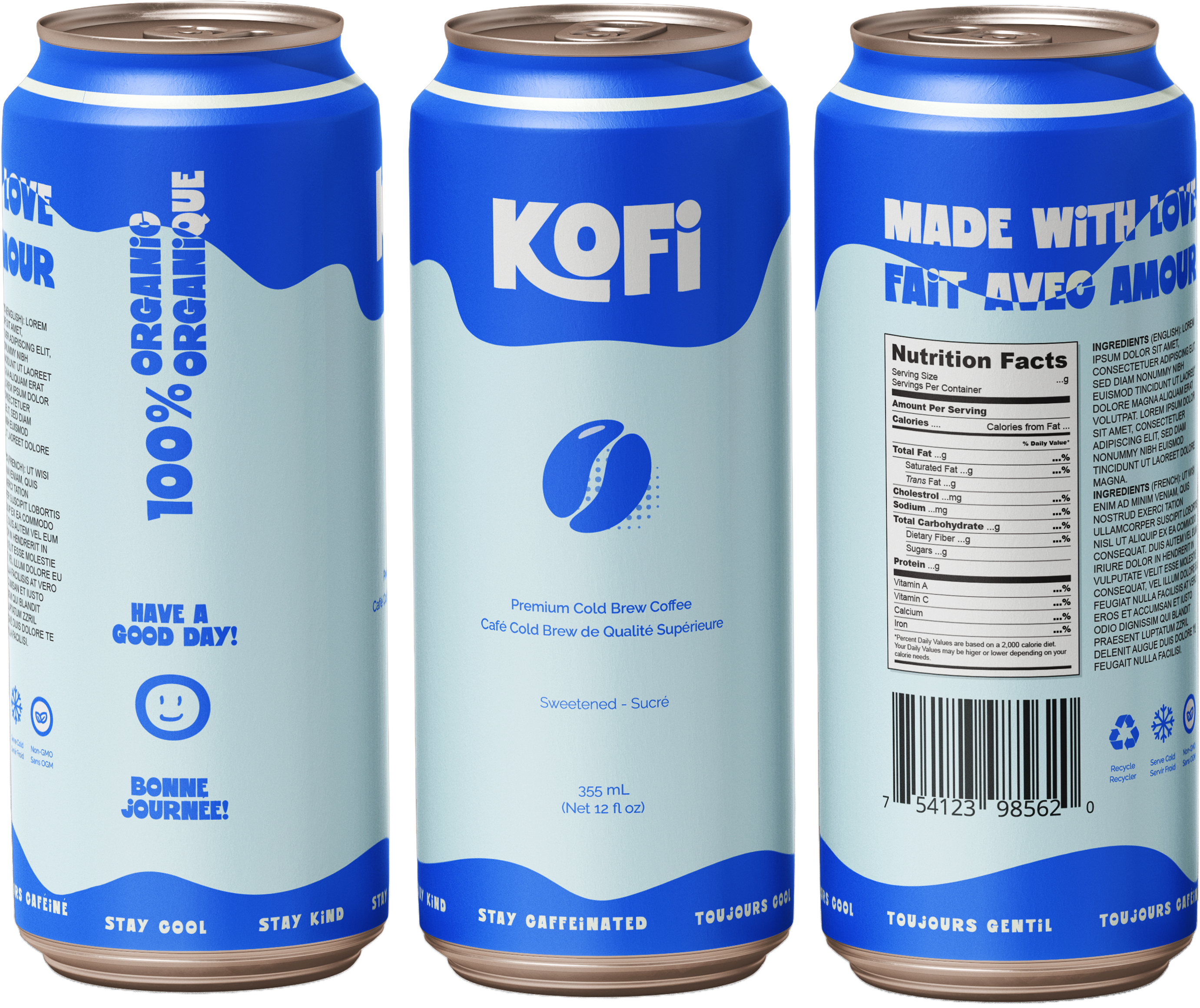
Key Design
Decisions
- Tall can format for stronger shelf presence and premium perception
- Playful colours to differentiate flavours
- Minimal layout to keep the brand clear and readable at a distance
- Bold & Playful typography for quick brand recognition
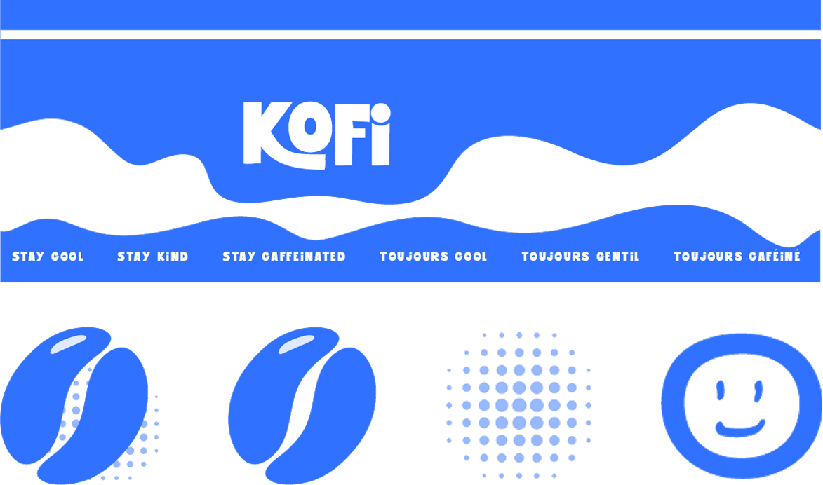
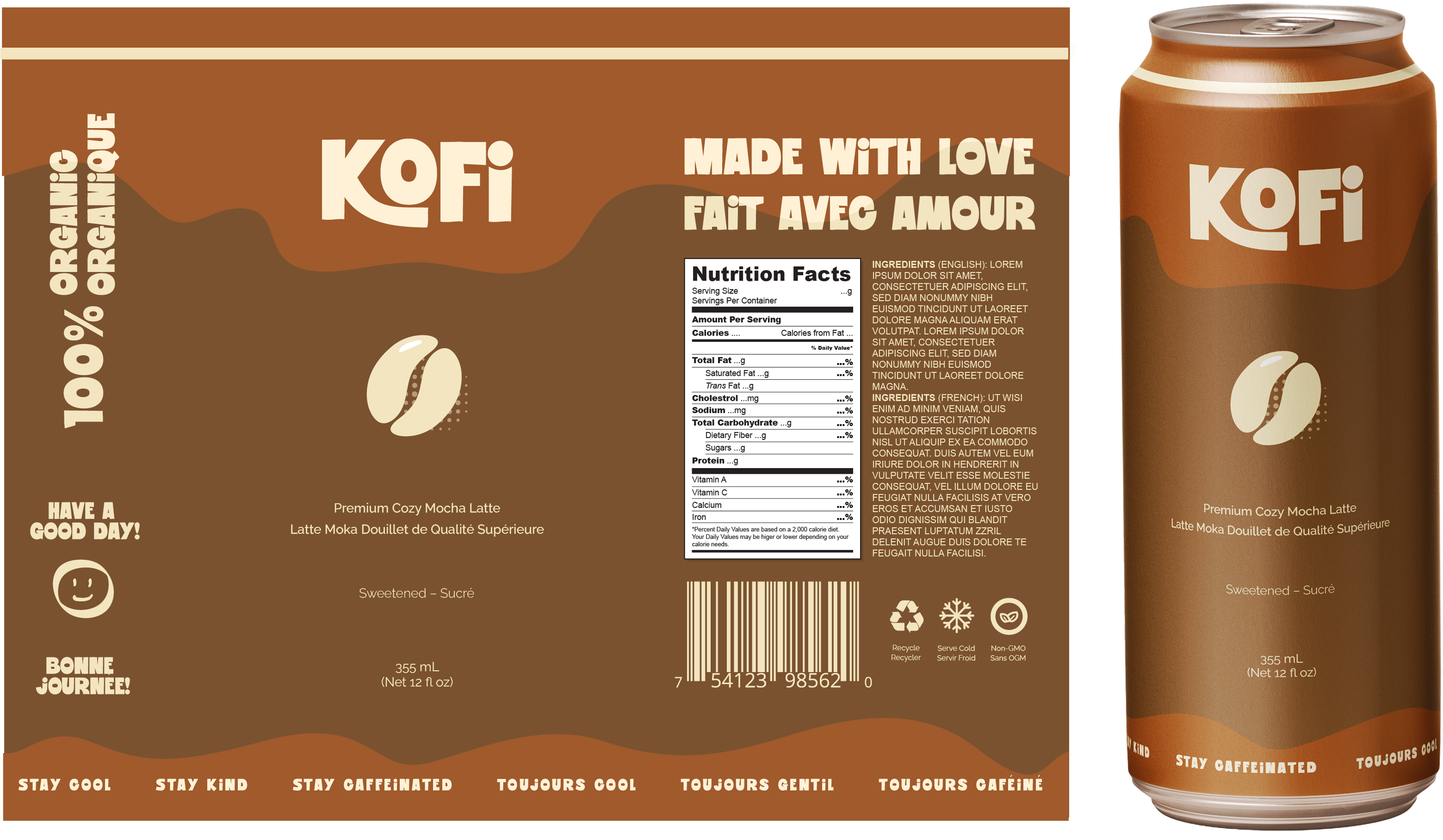
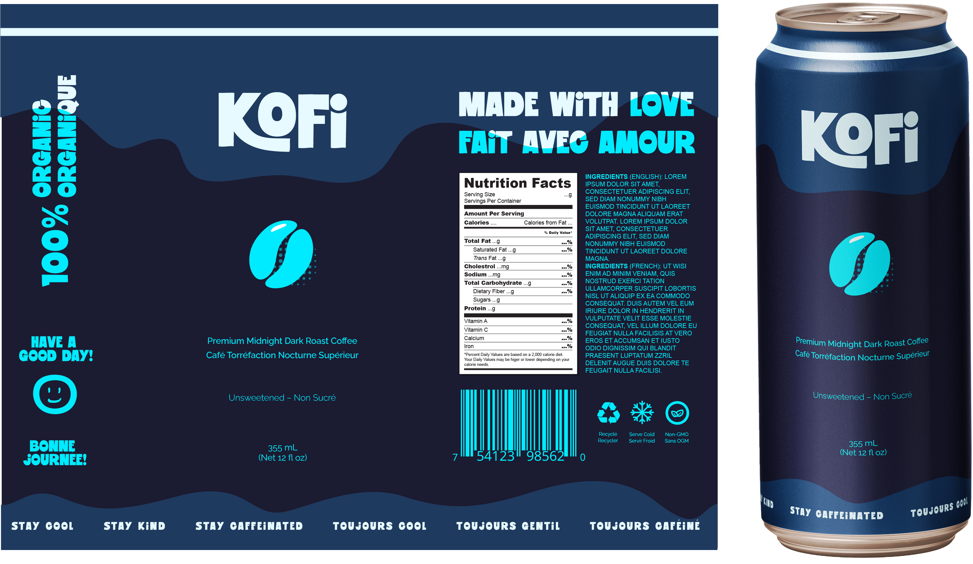
Branding
I illustrated a simple coffee bean and added a halftone-style shadow for texture.
I also placed positive words and blobs around the can to create a fun & welcoming feel.
Finally, I added a smiley face as an extra layer of positive energy.
Variations
I created two more variations to explore different visual styles while keeping the branding consistent.
I chose names that were descriptive yet appealing to highlight the drink’s flavour and vibe.
Adding "Premium" to the start of each drink name also helps elevate the perceived value.
Final Thoughts
Overall, this was a fun project to explore what designing a canned beverage would look like.
If I were to change one thing, I might try to combine the coffee bean and happy face into one mascot. I could then play around with more variations and it would also be more marketable.
Thank you, feel free to check out
my other works!